Daily Naan: because bland was never on the menu.
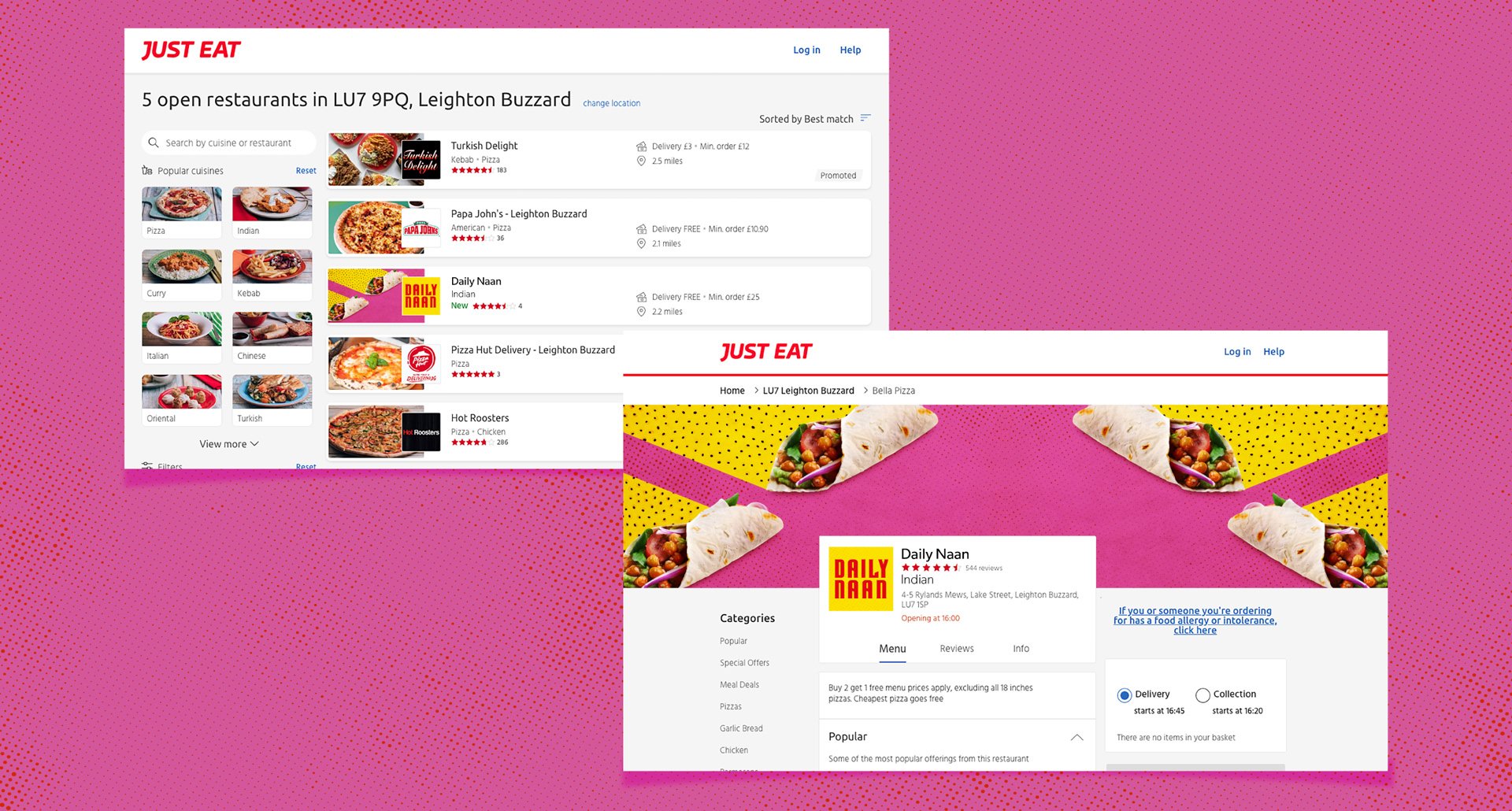
This one was for a digital-only food delivery brand cooked up by The Restaurant Group. With Gen Z and millennials as the target audience (read: professionally allergic to boring), the mission was clear—stand out, or get scrolled past.
I went all in with punchy, unprintable colours (thank you, online-only life), bold-as-you-like patterns, and a tone of voice that didn’t just speak—it flirted. The visual identity was all about flavour—loud, layered, and slightly chaotic in the best possible way. Think modern twist on naan bread, but make it brand.
At the heart of it was personality. Real, spicy, unforgettable character. Because if your brand doesn’t feel like someone you’d go to the pub with, what’s the point?
Project type: Brand creation
Industry: Food & beverage
Services: Copywriting / Creative / Social / Digital banners
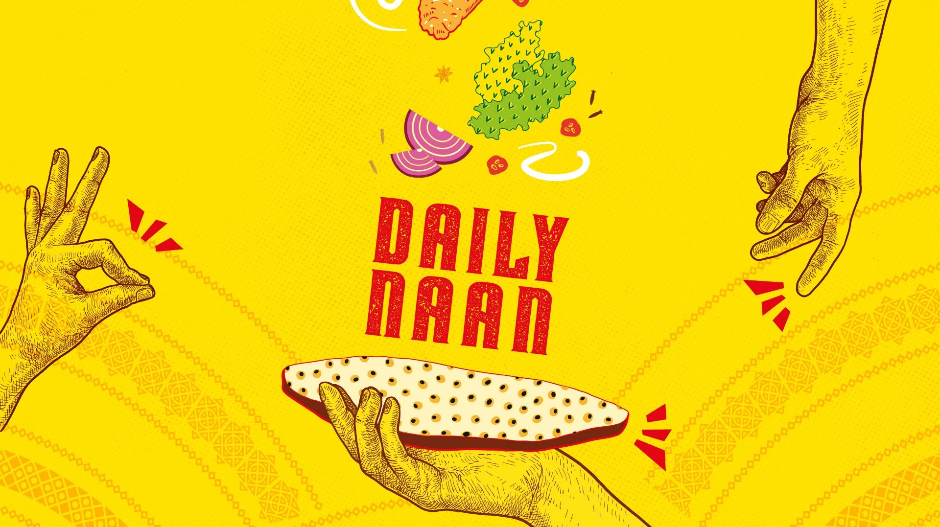
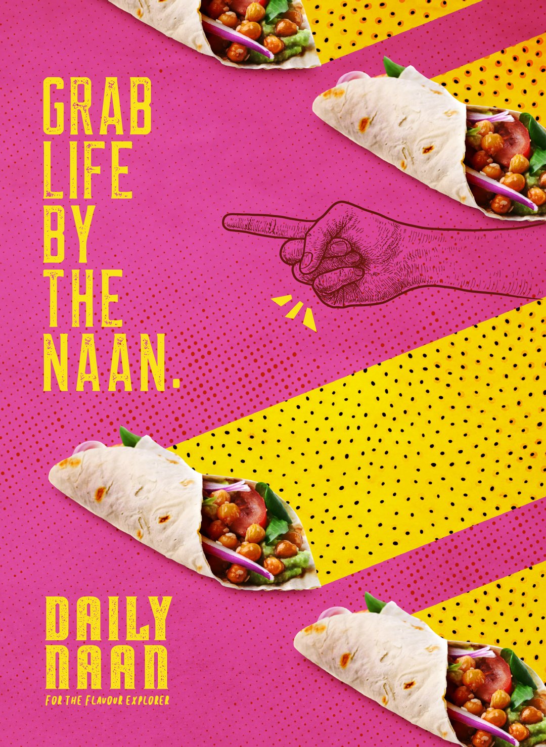
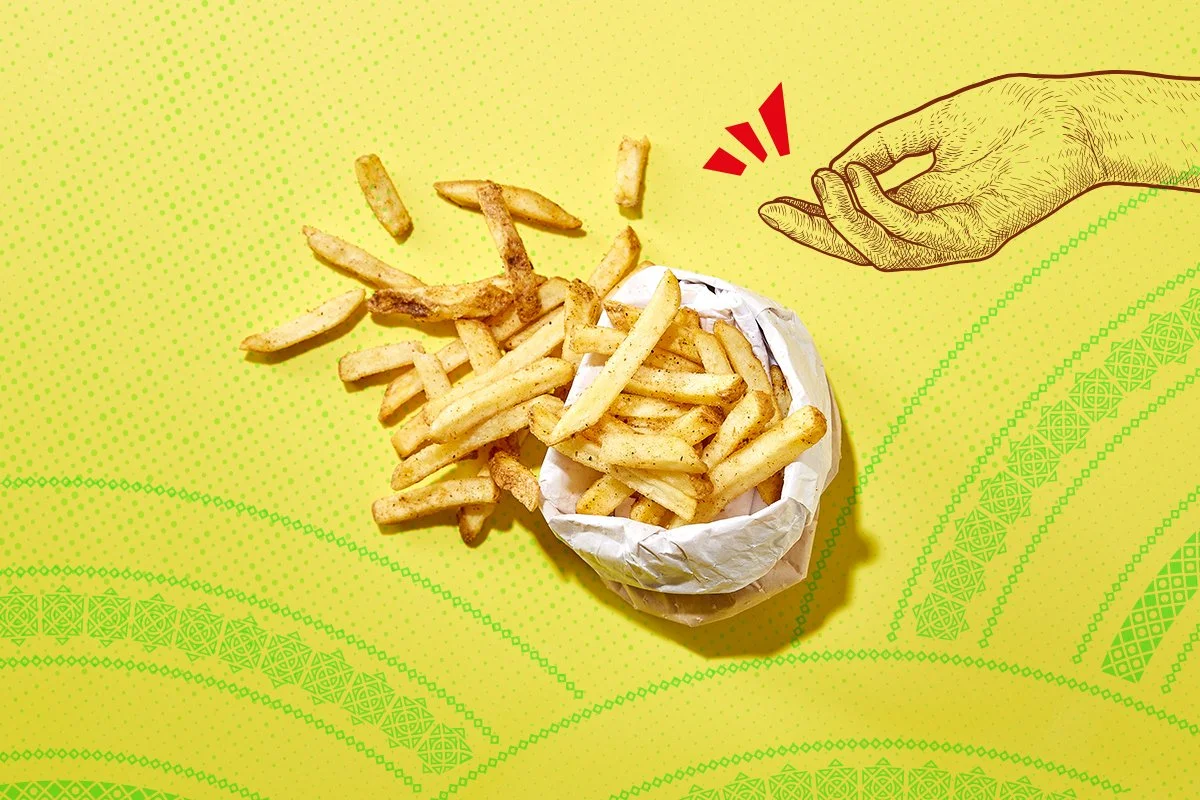
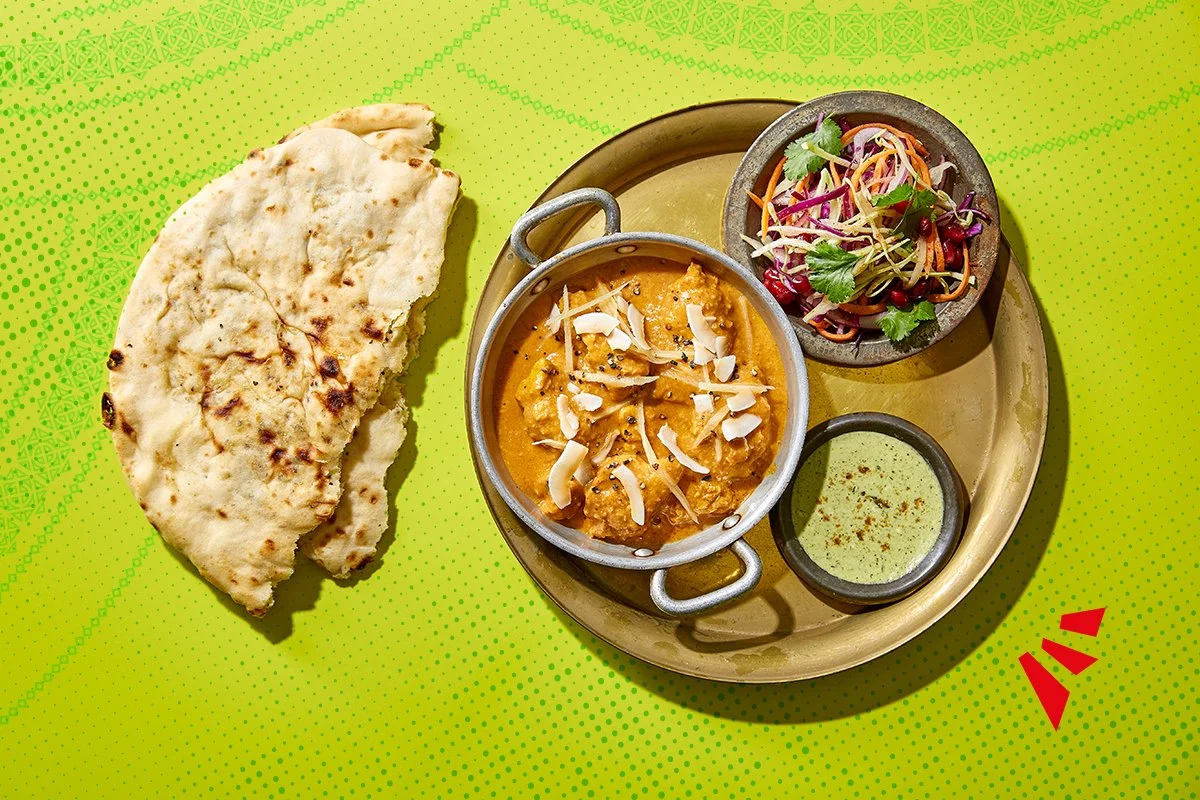
The visual identity mixed traditional Indian cues with a bold, stop-you-scrolling edge. Illustrated hands played with the food photography, while block colours hinted that the spice in each dish had its own agenda — a brand with flavour, and then some.
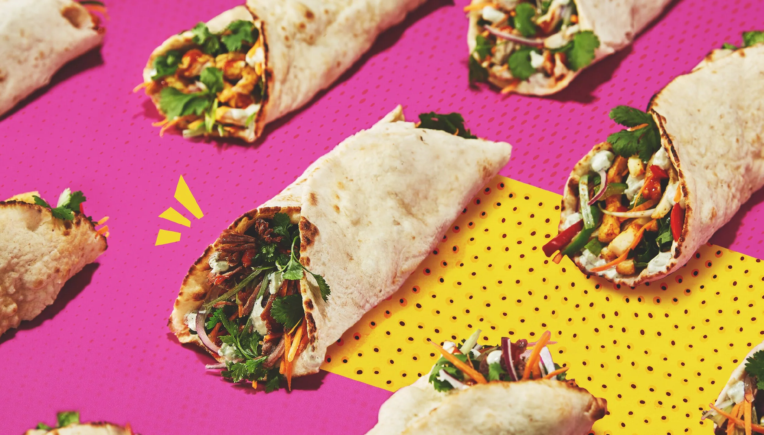
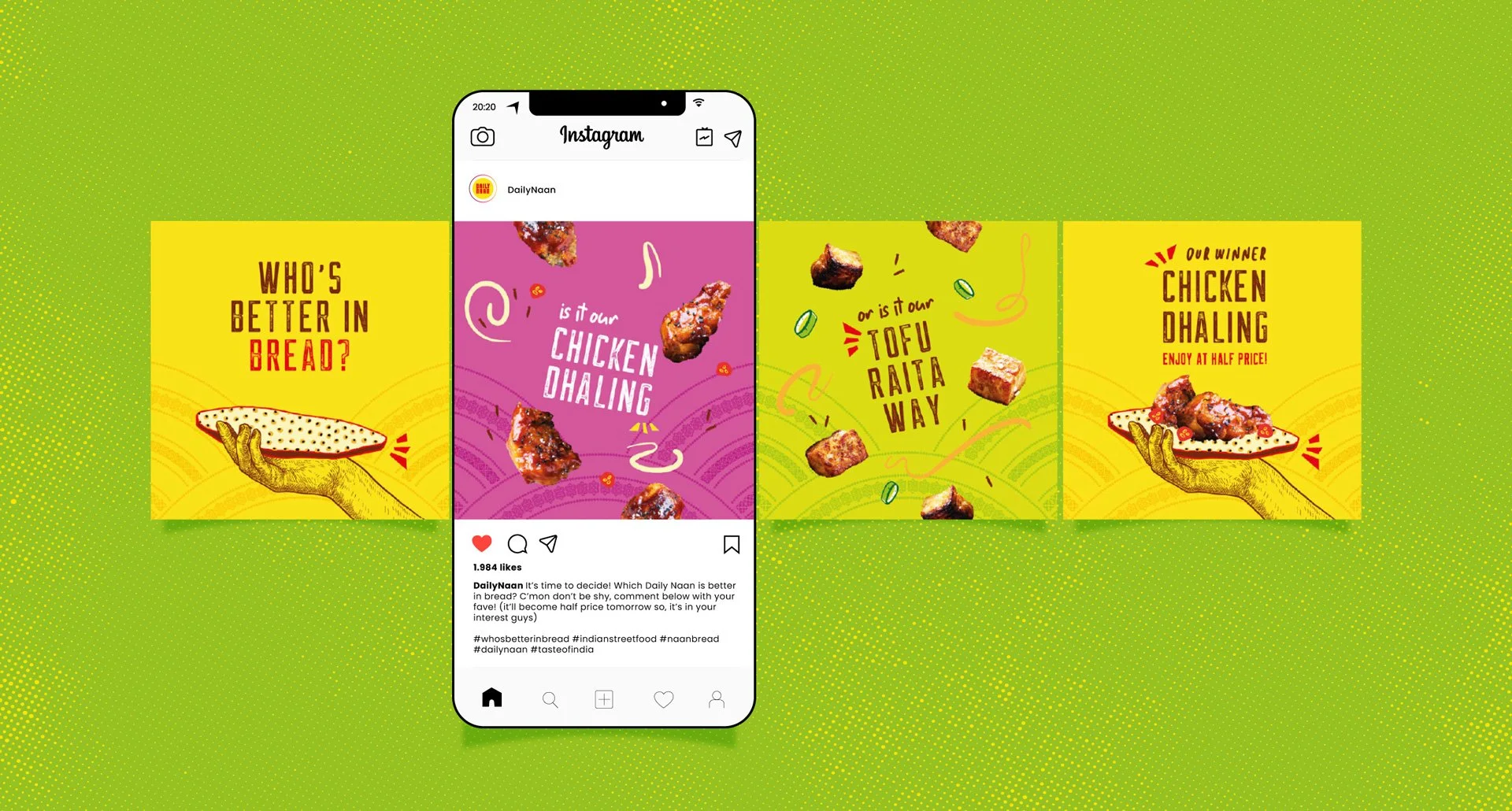
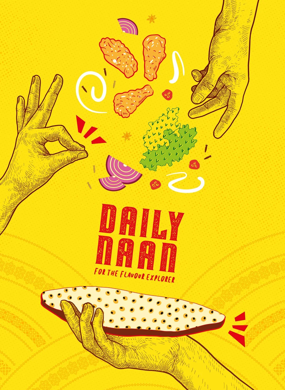
The mix of imagery and illustration gave the brand some range — enough space for both cultural authenticity and playful moments to sit side by side. It meant the identity could flex: grounded when it needed to be, expressive when it wanted to be.